End of Year Show Evaluation
Being the most substantial brief of the whole module, I have learned a lot about what it takes to work in the industry and just how tough it can be.
Having the opportunity to work directly with industry professionals and receive honest feedback about work was the most valuable aspect of the whole brief. Not only this, it proved how well I can work to deadlines and provide the work on time when it means most. Being able to visit their studio provided me with one of the first official ‘business trips’ ever, it was a thrilling experience to be able visit the Peter & Paul studio in Sheffield and meet the team there — But more importantly, it introduced me to the pressures of the industry whilst still at university, something of which gives me a great head start in knowing what to expect after graduation.
I always knew there was an element of going back and forth after feedback within projects, but this brief was a whole different kettle of fish. The amount of development and rationale that needed to be considered was like no other brief I’d ever worked on before. Initially having begun the project as individual practice, it added an interesting dynamic to then incorporate another party to assist in the rest of the development. This meant me partly dethatching myself from the brief, and allowing others to have equal say ion the design choices made.
Being able to pitch the final outcome to the board of directors was both thrilling and rewarding. I believed I thrived under the pressure of presenting the designs, having confidence in what we had created as a dynamic collective was definitely a determining factor within how the product was communicated to the client. With it being our first real taste of what it is like to go up against other designers and have to compete to win over the client.
If I were to do this brief again, I’d have more trust in myself that I could come up with something worthy instead of going solely off what was fed back to me, as an idea that we had later on in the brief become the selected direction. This not meaning to contradict the director of the project, but to make more suggestions and be brave with what I have to bring to the table. Since this was the first time I’d had my work picked apart so honestly, it was easy to let that effect my confidence at first, however, I quickly learnt that this is how it works in the industry.
Although we weren’t successful in our pitch, it was a great experience to work with Dan at Peter & Paul and create a pitch that received nothing but positive feedback, leaving me with confidence to go out into the professional industry and make the most of it.
Same but Different Evaluation
This brief has made me realise my passion for creating brands, having complete creative freedom in this brief, knowing that the client trusts you to create a successful outcome was a great way to execute this short brief.
Although the notice was short and the turnover was very brief, this had to be the most enjoyable brief this year, being one of the first ever projects to have approval in feedback from the first ever iteration allowed time to refine and really hone in on the overall quality of the outcomes.
One aspect of this brief that I would do differently if I were to do it again is be more clear on the print specifications to the client before they print the outcomes. However, having said this, due to budget restrictions, special print requirements were not an option.
Research Brief
Being able to expand on the research of Context of Practice was a great way to complete any unfinished business. Having a second party (Tom Hodkin) as a collaborator added a great second opinion to the mix, which helped keep the project unbiased.
Deciding to create a poster for this brief was simply down to identifying a problem that needed to be solved, creating a campaign that expressed how these people felt in the Instagram community about eventual demolition of the Welbeck Street car park.
Executing this brief on the basis that it would inform the end of year show outcomes meant that the research needed to cover the conceptual side of that particular practical project. Overall, this brief has helped us both clarify an appropriate concept to base our typeface design on, enabling us to make the most of the universities resources to maximise the potential of the end products and gain some attention at the show.
Aaron Leven Identity Evaluation
This particular brief was brought to me as I was head hunted by Aaron to create his identity, reason being he considered my design to be the best match to his photography style, since following my Instagram and looking at my website.
Meeting with Aaron before and during the brief ensured communication was kept at the highest standard, avoiding any possibility of going in a direction he didn’t particularly like. As this particular subject provided me with visual inspiration of what style of design they liked, it was slightly more difficult to make an informed design decision based on the work and overall tone of voice of the photographer. However, the outcomes were completely different to the images he supplied me with initially, this showing that a project can make swift U-turn, and that this was a perfect example of studying the body language and feedback of the client supplies to determine what kind of outcome they want.
Conclusively, this brief was a positive experience, and the outcome fits well within my portfolio, which isn’t always the case when working to create an outcome that fulfils the client’s visions.
Laura Sawyer Identity Evaluation
With this was the second brief with Laura (Same but Different) it was refreshing knowing that I was already on the same wavelength as this particular person. Her only request being that the outcomes were informed by her work and not simply there to look nice, as she knew the visual quality of the outcome was not of concern.
Having met multiple times and receiving a written brief at hand from the client was a much better way to go about a project of this nature. Having all of the vital information to begin with avoided any need to make contact for any other reason than to get feedback on the development and rationale.
If I were to execute this particular brief again, I’d give myself more creative freedom due to the nature of the client not being concerned about how it looks but rather how it is informed by their works and makes sense. This brief made me realise that every person’s needs differs, and it’s my job to accommodate for the unique circumstances of each individual client. Some may be more difficult than others, but this is a part of the design process and is all a part of good practice.
Go Higher Evaluation
With this being a brief that was executed during context of practice, it was a great example of managing my time more efficiently. By balancing 2 projects equally to ensure that I never left myself with too much to do after COP.
With this being a local competition and one to create a logo, I knew that it was a great opportunity to exhibit my skills in this area and have a good chance of being picked, coming as runner up gave me a confidence boost in terms of the sheer amount of branding projects that came after it. To know that I could produce an outcome for a genuine external client and be considered for winner.
With this being a more corporate brief, it was essential for me to be able to alter my mind-set in order to produce a successful outcome. Overall, this was a great mid-weight brief that helped get the ball rolling with extended practice.
Jessy Lanza – Leeds Print Festival Evaluation
With this being one of the smallest briefs of the year, I wanted to take the time to create something I’d want to have in my portfolio, seeing as I don’t intent to go fully print based, it was also a great chance to show my skills in other areas. Proving my ability to diversify my techniques based on the requirements of any given brief.
Deciding to execute this brief in a day added a decent element of pressure, not only because of the time-consuming screen print, but because the print was to be hung at the event that has our tutor is heavily associated with. Meaning I wanted to produce something that I’d be proud to associate with.
MAN UP Magazine Evaluation
This was an unusual brief to work on. With it being a collaboration between myself, the photographer, Ashley Renshaw, and three other graphic designers however the only form of communication I had was via the photographer.
With myself being assigned the job of applying a visual identity, brand and type treatment to the magazine and the other designers executing the image editorials, I needed to be versatile in the application as I was employed to pull it all together. This can often be the case in industry, when another designer executes a brand, and you have to work to their guidelines, so in terms of gaining skills, this project was a valuable experience.
I found this a great opportunity to create a piece of editorial I’d be happy to send to print and show to possible employers — the sheer quality of the images made my job much easier, in terms of how these particular images had a very predominant style, gelling perfectly with my style of design essentially enabled this to be a day long brief that could be used as a portfolio piece.
Conclusively, although editorial is not my chosen career path, it’s great to show I have the knowledge and skills to execute a project of this nature. The satisfaction of the end product has made me question my stance on editorial design of this particular nature (fashion mag).
Creative Networks Evaluation
This being the first extended practice brief, it was great way to warm up for larger more substantial projects. As well as this being a live competition brief plus a brilliant collaboration opportunity.
With this being an event associated with the university, it almost acts as a larger brand in itself, attracting many people from around the area to the university. With this in mind, it was vital that the nature of these posters painted the brand and the university in a positive light.
Overall, this project is one that I wasn’t as happy with as others, this is mostly down to the fact the turnover was short, but having said this it provided me with a great opportunity to expand my skills within after effects. However, having thorough summative feedback from the work was the most valuable factor, as this could inform the briefs after it, addressing any issues that may occur in later projects before they happen, it was a great opportunity to progress in my professional development as a designer.
Ashley Renshaw Logo Evaluation
Being an extremely short brief, it was unusual to have a turnover of a few hours, but helped me work in real time with a client, getting instant feedback that I could act upon to create a logo that Ashley was happy with.
There was more of an element of back-and-forth in this brief, compared to previous briefs even though it had a much shorter time frame. This may possibly be due to the fact the client requested more updates then before, making it harder for me to develop a design that could be better informed, but rather a logo that they found visually appealing in their opinion rather than going with something could be more thoroughly thought about.
Conclusively, this provided me with an insight to a unique situation created by this particular party, proving that every job is different and provides you with pressures in different area’s that you must deal with professionally and respectfully.
Logo-a-Day Evaluation
This was probably the most enjoyable brief of all, being the only completely self-initiated brief, I wanted it to form an investigation into my working habits, but more importantly to help me develop my style and confidence when working under pressure.
Having executed all of the logos and persistently posting them onto my Instagram account as a form of self-promotion, which essentially worked hence the reason I was approached by 5 photographers on different occasions asking me to design a logo for them — this was hugely satisfying for me and provided me with the confidence of knowing people trust me to design something they’d be happy with.
Adding the extra outcomes to present this brief added a personal touch, and by using my brand colours, helped make the project even more associated with me and my brand. This brief is a great one to have in my portfolio, as it will provide a refreshing contrast to the more serious projects alongside it.
OUGD603 Evaluation
Extended practice has been a huge test of my time management, ability to work under pressure, but more importantly how to deliver when it matters, like when a client is relying on you to produce an appropriate response a given brief.
I have learned more about myself as a designer this year than in any previous year before it, this is mainly down to the fact that having the ability to choose your own briefs and steer yourself into an area of design you want to pursue after graduation. Realising that this year was less about grade hunting and more about developing a portfolio you’re proud of was key in finding my feet to further develop my understanding of design as I know it. Discovering the likes of David Rudnick, Hassan Rahim and OK-RM has helped me develop my style and striking a balance of utilising trends in contemporary graphic design responsibly to produce responses that would otherwise be less better off without these influences.
Broadening my horizons in such a way came after completing my dissertation, and realising that the passion I put into that project fed into my extended practice, discovering the importance of conceptualisation within projects has elevated my understanding of graphic design. Making it more than a case of producing something that looks appealing, but combining that with informed decisions based on research unique to that particular brief.
This module has really prepared me well for the professional industry. Having gone through probably one of the hardest yet rewarding years of my life has made me realise design is what I’m passionate about. It’s certainly had its ups and downs, such as when clients are overly vague with feedback or just difficult to work with, but this is something that comes with the job. Understanding the client’s needs and fulfilling them is essentially what it comes down to.
My experience over the course of this module has been mostly positive, being more engaged compared to previous years, ensuring I attend every day and staying until 5pm has prepared me for life after university, and has simply become a part of my everyday life, allowing me to adapt to the professional industry much quicker than if I’d have harboured any other attitude. This also most importantly has helped me reach my maximum working potential, being able to get constant feedback on designs from peers has made me much more of an adaptable designer than before. To sum up, this module has been a challenging, rewarding and at times frustrating experience, but without these frustrations would mean one doesn’t have passion for design.

Monday, 15 May 2017
Saturday, 13 May 2017
Friday, 12 May 2017
Final Magazine — MAN UP — OUGD603
Cover & Title Pages
The final cover and title pages mocked up.
As this was a day long brief so close to the module deadline, it did not seem realistic to print and bind (externally or internally) as this would have essentially rushed the process and the outcome would not reflect the quality content. This was a joint decision by the client and myself. However, the final magazine will be professionally printed and bound to feature in both of our portfolios.


Internal Pages
Overall, the outcomes I have produced reflected the images exactly how Ashley envisioned.
With this being a last minute request hence the 1 day deadline (Due to the time it took to get the images and document from the other collaborators) it was great to spend more time chatting with the client before delving into the design myself. This enabled the final resolution to be executed without much back-and-forth feedback.


Thursday, 11 May 2017
Title Pages — MAN UP — OUGD603
Title Pages
The title pages were a simple case of utilising the same design choices in the previous pages, like centrally aligned, Dharma heading and Suisse Int’l Mono copy. The only change occurring here was the incorporation of the lighter type to di erentiate the name from the role, also assisting in leading the eye down the type hierarchy.
This was a simple exhibition of keeping it consistent. A vital aspect in this particular project due to the fact every editorial is slightly different.

This is one of the most important aspects in terms of tying the whole mag together, so it's paramount it is kept the same throughout the mag.
Wednesday, 10 May 2017
Contents & Title Page Development — MAN UP — OUGD603


Contents Page
This was a very simple case of going o what the client had supplied me with for visual inspiration.
Adding my own application through the unique grid allowed the editorials to feel more a part of a single magazine rather than 9 separate projects.
Title Page
To maintain consistency, titles will be kept large to fit with the logo on the from of the mag
Internal Experiments — MAN UP — OUGD603


Accreditation Page & Body Copy Typeface
After suggesting F Grotesk for body copy, it was fed back that it looked too formal. After switching to Suisse Int’l Mono with the justi cation that it o ers a slight hint of informality whilst maintaining legibility and also the overall cleanliness of the layout he swiftly agreed.
Final Covers — MAN UP — OUGD603
Now that the logo had been selected it was a matter of applying it to the multiple images the client had requested:


Typeface Application
Applying the chosen logo to other images meant that the ll needed to be changed. However it is clear upon direct comparison the typeface is heavy enough to give a strong contrast, and still be recognisable as a brand. This also opened up opportunities to use more informed colour choices such as the type for bloodline, where there is a certain sense of irony using stereotypically ‘feminine’ colours for something which suggests the opposite.
Informing the typeface like this made the client change his cover image to Bloodline, from Red, reasons being he liked how it gave more of a hint towards the context of the magazine rather than being on the more obscure side as it was previously.
Tuesday, 9 May 2017
Internal Research — MAN UP — OUGD603


Contents Page
Meeting with Ashley on multiple occasions before starting the project allowed us to discuss what he wanted the overall tone of voice and visual direction to be like.
This meant looking at various magazines, having him talk me through what he liked, what he didn’t and also what my informed opinion was on it.
Accreditation Pages
With these being the most text heavy pages in the book it was vital that they were readable and re ected the cleanliness of the images taken. After being shown a page where all of the body copy was on top of an image, I persuaded that this is not the best way to go about it as it makes the text nearly impossible to read, which for something like a credit page, is very important.
Title Pages
This was an important aspect of the magazine to the client as
this is where the credits go, and also, as the editorial aspect of
the publications was executed by other designers to their own speci cations, it is the area that ties the whole magazine together.
It was obvious that the typeface on the front cover needed to be carried through the rest to ensure the consistency he was after. However a new typeface needed to be selected for body copy to increase legibility and provide a better contrast to the extremely bold titles.
Cover Research — MAN UP — OUGD603
The client has a clear vision of what they wanted the cover to look like, so they sent over a few examples as shown below:


There is a clear correlation of bold sans serif typefaces which provide much contrast to the image. This particular instance requires a total of 4 covers so the magazine can act as a part of a series of issues, so the logo needs to be readable on any background, therefore a bold typeface will enable the type to be highly visible on the page, allowing a more versatile use of the logo.

Sunday, 7 May 2017
Online Campaign — Research Brief — OUGD603
As a printed poster was the physical outcome, it seemed appropriate to also do an online campaign that could be incorporated into Instagram and promoted through the pages researched like @brutal_architecture:

Application:


Saturday, 6 May 2017
Poster Research — Research Brief — OUGD603
Looking at various formats that could inspire the final outcome for the presentation of the data, we eventually decided on a poster, as it provides a solid contrast to the nature of the research. With it all being screen based, printing it seemed to make it more thought provoking than being something that can be scrolled past in a second.
Opting for a poster instead of a publication stems from the fact information on your mobile is available instantly, therefore having the research on a single side of A3 means it can be observed much quicker.
Stuart Brown:
Stuart created a set of posters to commemorate his favourite brutalist buildings, and they work really well, with their black and white compositions and straight to the point communication.


A poster produced by the Royal Institute of Architects as part of the Save Council House campaign 1994/95:

Stock Choice
Opting for G. F. Smith Colorplan Smoke extends back to my personal branding, in that it resembles the same shade as concrete, fitting perfectly with the context of this particular research.

Opting for a poster instead of a publication stems from the fact information on your mobile is available instantly, therefore having the research on a single side of A3 means it can be observed much quicker.
Stuart Brown:
Stuart created a set of posters to commemorate his favourite brutalist buildings, and they work really well, with their black and white compositions and straight to the point communication.


A poster produced by the Royal Institute of Architects as part of the Save Council House campaign 1994/95:

This poster is of huge significant to our research, the face that this has been an issue since 1945 says a lot about the reasons for doing a research project of this nature.
Stock Choice
Opting for G. F. Smith Colorplan Smoke extends back to my personal branding, in that it resembles the same shade as concrete, fitting perfectly with the context of this particular research.

Thursday, 4 May 2017
Decision not to List the Welbeck Street Car Park — Research Brief — OUGD603

A Historic England spokesman said:
"While the car park on Welbeck Street stands out nationally as an exemplar of 1960s car parks, it does not meet the very high bar for listing buildings of this date. Designed by Michael Blampied and Partners 1968-70, it does not compare well with more striking and slightly earlier commercial buildings in the Pop Art movement from which it derives.
"The car park is not innovatory in terms of its structure and also exhibits flaws in its design. The car parking floors are compromised by the less well designed ground-floor arcade. The Pop Art inspired façade is also a relatively late example of the artistic style applied to architecture and the split-level deck system for car parking was, by the late 1960s, a long-established model."
6 March 2017
It is this statement that caused the uproar on social media, and rightfully so, it is this that represents a deeper political issue with the current system. As this car park is in the heart of London (Westminster) a hotel, which is the building that is going to replace this particular one will generate more revenue.
Conclusively, it is boiling down to the £100m deal that it cost to purchase the car park, or more specifically the land on which it resides. Making it about money rather than true architectural excellence.
Barnabas Calder Talk after Welbeck St. Meet-up — Research Brief — OUGD603
Dr Barnabas Calder, who we previously emailed, speaking after the NCP car park Welbeck Street meet-up, organised through Instagram, proving that the social media aspect of publicising Brutalist architecture is more than just a trend - it's a community.
Wednesday, 3 May 2017
Cover Experiments — MAN UP — OUGD603
Bold, Striking Typeface
The typeface had to be impactive and fashionable, the obvious choice was Druk as this has many ephemeral uses, however, it is used in many magazines of the same nature as shown in the previous board. So Choosing to avoid this and going with other options that have the same versatility and impact was a must.
Possible type choices:
Dharma Gothic Condensed
Prohibition
Blair ITC
Akzidenz Grotesk Pro


Feedback
Overall, the reaction to the cover experimentation was extremely positive. Allowing Ashley to have a broad selection to choose from allowed this aspect of the magazine to be dealt with in a timely manner allowing more time for the important aspects like content.
One aspect of the cover type that was ruled out early was as this particular image is very dark, the block colour type takes too much away from the image, outlining solved this issue.
The selected typeface was Dharma Gothic Condensed, for it’s sheer impact and on trend appearance.
Preston Bus Station (Successful Campaigning) — Research Brief — OUGD603
To give this particular brief more of an issue to solve, it seems appropriate to create some form of poster that could campaign to save the car park.
This particular example successful campaigning to list a building marked a huge victory for modernist and brutalist architecture, and also marking the turning point, with many buildings of this era following suit and being recognised as genuine architectural symbols and listed by Historic England.
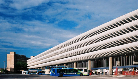
"Architecture minister Ed Vaizey announced earlier today his decision to protect the concrete post-war building, which was set to be replaced by a smaller bus station as part of a regeneration of Preston's city centre."
"The result marks the end of a long campaign to save the structure that was designed in the 1960s by Keith Ingham and Charles Wilson of architecture firm BDP. This was the fourth time the building had been put forward for listing and its protection has been supported by a host of architects including Richard Rogers and OMA."
"Grade II listed buildings are considered 'nationally important and of special interest' and alteration or demolition requires listed building consent, making it harder - but not impossible - for the bus station to be knocked down."
This particular example successful campaigning to list a building marked a huge victory for modernist and brutalist architecture, and also marking the turning point, with many buildings of this era following suit and being recognised as genuine architectural symbols and listed by Historic England.
"Architecture minister Ed Vaizey announced earlier today his decision to protect the concrete post-war building, which was set to be replaced by a smaller bus station as part of a regeneration of Preston's city centre."
"The result marks the end of a long campaign to save the structure that was designed in the 1960s by Keith Ingham and Charles Wilson of architecture firm BDP. This was the fourth time the building had been put forward for listing and its protection has been supported by a host of architects including Richard Rogers and OMA."
"Grade II listed buildings are considered 'nationally important and of special interest' and alteration or demolition requires listed building consent, making it harder - but not impossible - for the bus station to be knocked down."
Subscribe to:
Comments
(
Atom
)